🎉📚Get the #15DaysOfCSS e-book📚🎉
These #15DaysOfCSS posts will be compiled into an e-book — pre-order now!
Email is great, and blogs are awesome, but it can be challenging to use them as a reference in the future. We'll be assembling this month's work into an e-book.
On our last day of #15DaysOfCSS, we present the Fat Footer, also known as the Sitemap Footer. (If you missed Days 1-14, we'll tell you how to catch up with all of our posts at the end of this email!)
You've seen this pattern on many websites. Since we've talked so much about Font Awesome this week, here's the fat footer at the bottom of their site:
In today's websites, fat footers are used to meet accessibility and search engine requirements, exposing all links for easy browsing. The location at the end of the page is consistent, and users expect to find helpful navigation there as much as the navigation bar at the top of the page.
After the crazy responsive navbars we've been building this week, the fat footer is delightfully simple. It also gives us a chance to introduce you to a few new concepts in layout you might enjoy, as well as some thinking about selectors.
Step 1: Start with structured HTML
In today's CodePen example, we have five main navigation items, and four of them have a second level of navigation. Make sure you mark up your nested lists correctly!
  <nav>
    <ul>
      <li><a href="#">Home</a></li>
      <li><a href="#">About</a>
        <ul>
          <li><a href="#">Mission</a></li>
          <li><a href="#">Vision</a></li>
          <li><a href="#">Board of Directors</a></li>
          <li><a href="#">Careers</a></li>
        </ul>
      </li>
... etc etc etc ...
  </ul>
</nav>
We have used a <nav> element around our fat footer. The reason why is because it includes all of the links on the site. This could be major navigation as a result! You might also use the <nav> element around any navigation at the top of the page, as that may also be major navigation.
The <footer> element would wrap around the entire footer. Footers might include logos, descriptions, addresses, or other information in addition to the navigation.
Step 2: Boilerplate CSS
🖥 Follow along with today's CodePen example
We'll set up some basic styling outside of the media query. These styles are all concepts we've discussed many times in previous emails.
html {
  box-sizing: border-box;
}
*,
*::before,
*::after {
  box-sizing: inherit;
}
body {
  font-family: 'Roboto Condensed', sans-serif;
  font-size: 1.5rem;
}
ul {
  list-style-type: none;
  margin: 0;
  padding: 0;
}
a {
  color: white;
  text-decoration: none;
  display: block;
}
a:focus {
  outline: 2px solid black;
}
a:hover {
  color: #fed330;
}
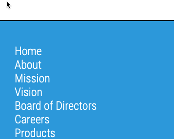
This styling produces some white links on a white background by default, so if you suddenly see nothing, that's great! 🤣
To fix that problem, let's make our footer look like a footer. Let's give it a background color and some spacing to make it look a little prettier.
nav {
  margin-top: 5rem;
  padding: 3rem 2rem;
  background-color: #2d98da;
  border-top: 2px solid black;
}
Nice — however, you may be bothered by the fact that the color doesn't go all the way across the browser window. There's a tiny white border that runs around all of the blue area. Why is that?
The <body> element has a little bit of margin or padding assigned to it by default, depending on what browser you're using. To the body style then, let's turn that off:
body {
  padding: 0;
  margin: 0;
}Step 3: Mobile styles
🖥 Follow along with today's CodePen example
Our fat footer has lovely colors, but it is one long list of links... not very helpful. Let's distinguish between the main navigation links (Home, About, Education, Products, Contact) and the sub-links.
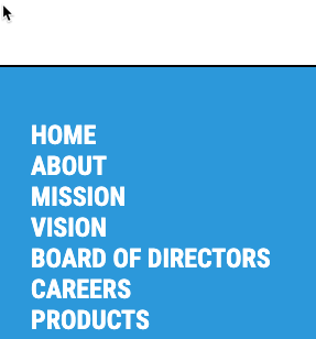
To our main navigation links, let's make them bold and uppercase.
ul {
  font-weight: 700;
  text-transform: uppercase;
}
Well... that's great, but now they are ALL bold and uppercase! How can we make this style affect only the top links?
One possibility is to simply line up a second declaration that neutralizes these styles for levels of navigation beyond the first level.
ul ul {
  font-weight: 400;
  text-transform: capitalize;
}
Better and better! We're almost done with mobile, but we have a few tiny things to resolve first. First, could we put more space between the links? And second, could we break up this long list of navigation into chunks?
Of course we can!
ul {
  line-height: 1.5;
}
nav > ul > li {
  margin-bottom: 3rem;
}
To generate more space between links, we used the line-height property. Notice it has no units. It can take units, but it's often best to leave it without units, so that line-height may adjust easily to different font sizes.
The second selector looks a bit odd. The > symbol is the child combinator. The child combinator specifies a relationship between parent and child. In this case, we're saying a li element whose parent is a ul element whose parent is a nav element. This selects our first level of navigation only, whereas the second level of navigation is unaffected by this style. Had we chosen nav ul li as our selector instead, then both levels of navigation would be affected by these styles.
As a result of both of these styles, we have nicely grouped navigation with space between links.
Step 4: Tablet styles
🖥 Follow along with today's CodePen example
The list of links like this is OK for tablet, but it is a little long -- and it might be VERY long with a longer menu.
This might be a good time to make use of CSS columns. With just a little code, we can wrap our long list into two columns instead of one.
@media (min-width: 450px) {
  ul {
    columns: 2;
  }
  ul ul {
    columns: 1;
  }
}
Columns are flexible and will break where needed. Think about a dead-tree newspaper and how its columns typically work. That’s the same as we have here.
Step 5: Desktop styles
🖥 Follow along with today's CodePen example
On desktop, the footer typically stretches across the page. We haven't used Flexbox to this point; here would be a great place to include it.
@media (min-width: 850px) {
  ul {
    display: flex;
    flex-flow: row wrap;
    justify-content: center;
    gap: 2rem;
  }
  ul ul {
    display: block;
  }
}
The top-level <ul> will be displayed as Flexbox. Any following <ul> elements will be simple vertical lists. You could also keep the Flexbox display and switch to a column.
And that's it! See today's CodePen example for the final HTML and CSS.
🎉🎊🥳 Thank you! Next steps! 🎉🎊🥳
Thank you so much for joining us on #15DaysOfCSS! We had a fantastic time bringing you this material, and we hoped you learned a ton.
We’ll be around for the next month or so, giving feedback on the challenges from the course. So if you haven’t finished them yet, we’ll be here!
✅ Please give us some feedback 🚀
Please take 2 minutes to fill out our quick feedback form. We used your #30DaysOfHTML feedback to improve this course and hope you liked the changes.
👍 If you liked the course… 💖
📚 Buy the #15DaysOfCSS ebook, releasing in November and containing all of these blog posts in one place. EPUB format.
🤷🏻 Did you miss some posts? 🤷🏿♂️
They are always available on the Substack website. You may also subscribe on-demand to the #15DaysOfCSS series to start at anytime - it’s still free!
🖥 Today’s CodePen examples
Follow along with today's CodePen example
👩🏽💻 Challenge: Favorite Internet Animals
👩🏽💻 We close with a fat footer of your favorite internet animals: parkour squirrels, skateboarding dogs, internet cats, and predictive rodents.
📚 More information and examples
📚 Fat Footer Design Pattern (examples and design inspirations)
📽 LinkedIn Learning: HTML and CSS Creating Navigation Bars (subscription required)
📽 Flexbox and Grid version 2 at Frontend Masters (subscription required)


