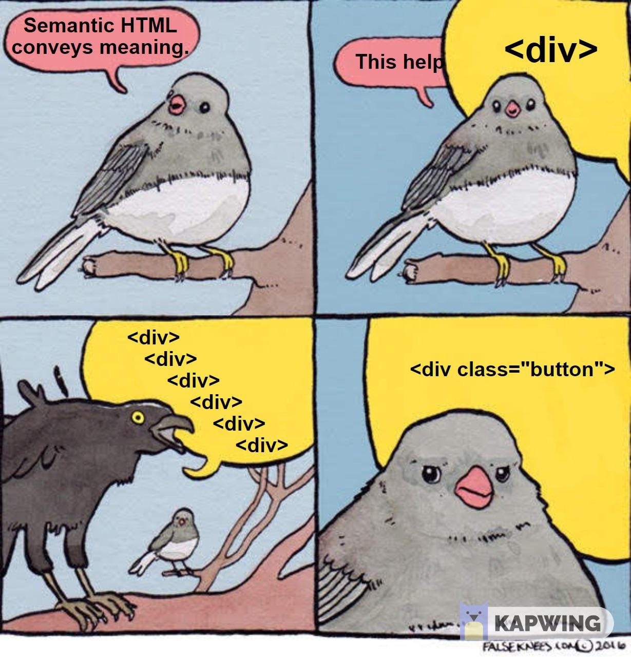
<nav> is for navigation. You knew that. But still, we're horrified by the markup we see as "navigation" these days. We can do better.
What <nav> is for
Both MDN and WHATWG state that <nav> is for "major navigation blocks" on the site. What might that mean?
✅ Your main navigation bar, usually located somewhere near the top of the page.
✅ Sub-navigation for the page, maybe in a left column.
✅ A table of contents for longer documents.
✅ An index.
What <nav> isn't for
⛔️ Links in the footer to terms and conditions, privacy policy, etc. This isn't "major" navigation. Still, mark this up as an unordered list.
⛔️ Every link that goes anywhere on your page.
Marking up navbars
✅ Navigation is a list of links. Although the marketing people deeply care about what order they links are listed in, they could be visited in any order. With that description, you know exactly how a navbar should be marked up.
<nav>
   <ul>
     <li><a href="#">Home</a></li>
     <li><a href="#">About</a></li>
     <li><a href="#">Contact</a></li>
   </ul>
</nav>
This produces a vertical navbar by default. CSS makes it go whatever way you want.
⛔️ This is not a navbar.
<nav> <a href="#">Home</a> <a href="#">About</a> <a href="#">Contact</a> </nav> ⛔️⛔️This is even worse.
<div class="nav"> <a href="#">Home</a> <a href="#">About</a> <a href="#">Contact</a> </div> Make it horizontal
Making a horizontal navbar is the easiest thing in the world with Flexbox, or if you're old-school, inline-block. (We have an inline-block example in 🖥 today's CodePen demo.)
When working in Flexbox, consider the parents (flex containers) and children (flex items). Flex containers are where you declare display: flex and alignment of the flex items. Flex items are where you declare the flex-basis (like width, but squishy and flexible). 📚 CSS Tricks has a lookup for all of these properties and values.
In the standard navbar markup:
<nav>
   <ul>
     <li><a href="#">Home</a></li>
     <li><a href="#">About</a></li>
     <li><a href="#">Contact</a></li>
   </ul>
</nav>
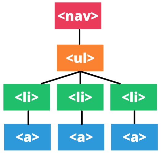
We could diagram this visually as follows:
Where do we assign display: flex? On the <ul>. The <ul> will act as a row for us, with the <li> elements behaving as individual navigation elements. With a handful of simple styles, we get a horizontal navbar with ease. 🖥 See our CodePen demo for a full demonstration of this.
CSS Hamburgers
Are you a "hamburger menu" fan? It's possible to build this using only CSS, using the :target pseudoclass (not the checkbox trick!).
📚 Responsive, Pure CSS Off-Canvas Hamburger Menu
Jen's 🎥 Advanced CSS Layouts course at Frontend Masters covers this technique as well (subscription required).
Learning Flexbox
🎥 SUBSCRIPTION REQUIRED: Jen's Frontend Masters course, "CSS Grids and Flexbox for Responsive Web Design" will step you through working with Flexbox and Grid. While the course was originally recorded in 2017, Jen will be updating it with new material August 18-19, 2021. The recording will be available shortly afterwards.
🎥 FREE: Jen believes there's only 3-4 properties that make 95% of Flexbox layouts work. It's way easier to learn when you focus on those critical properties, rather than all of the exceptions that you will look up later. In the free Frontend Masters Bootcamp, Jen walks you through these properties in Flexbox. Scroll down to the "CSS Layouts with Flexbox" section. There's less than 20 minutes of video to watch.
<nav> demo - making nav bars horizontal
🖥 View the <nav> demo on CodePen. We’ll show you how to make navbars go horizontal with inline-block and with Flexbox.
Challenge: Styling navbars
👩🏽💻 Try today’s CodePen Challenge about styling navbars. Can you complete the Advanced Level, coding navbars with a CSS-only hamburger button? When you’ve completed it, post your answer in our discussion in Substack.
More information and examples: Flexbox
🎥 Jen at Frontend Masters: CSS Grids and Flexbox for Responsive Web Design (subscription required)
🎥 Jen at Frontend Masters Bootcamp: CSS Layout with Flexbox (free)
📚 Responsive, Pure CSS Off-Canvas Hamburger Menu
📚 CSS Tricks: Responsive Menu Concepts


i am making website using wordpress - https://bestbull.xyz and also learning how can i make website from scrach.
I want to create accessible sites while using WordPress, and I must say, this course reveals that I still have a job to do. On some of my blog posts (eg https://oldrup.dk/security-headers/) , I use a TOC plugin, and while it does wrap items as an ordered list, the container is a div. I'm not taking today's challenge. Instead, I will get in touch with the TOC plugin developer to see if I can persuade him into more semantic HTML :)