

#15DaysOfCSS Day 12: Responsive Navbars
Changing layouts across devices

🎉📚Get the #15DaysOfCSS e-book📚🎉
These #15DaysOfCSS posts will be compiled into an e-book — pre-order now!
Email is great, and blogs are awesome, but it can be challenging to use them as a reference in the future. We'll be assembling this month's work into an e-book.
So far, all of our navbars have been oriented towards desktop configurations. The links will wrap if the screen gets too small, but the subsequent navbar doesn't necessarily look pretty if that happens.
Responsive design is a big topic, and it's hard to explain it from the beginning in a few emails. Responsive design means website layouts change according to certain conditions in screen displays. To this point in history, these tests have primarily been screen width, as tested by media queries.

🖥 Desktop first vs. 📱 mobile first
About 10 years ago, Luke Wroblewski coined and defined "mobile first" as a term and wrote an influential book on the topic. His book was very much in the UX context, not about CSS. At the time, designers typically loaded up a desktop design with a ton of content, then tried to figure out how to whittle that down to less content for a small device. Wroblewski's argument is that if the heart of your website's content was on the mobile device, why dilute with more irrelevant information on desktop? Start with the mobile message, then redesign for desktop.
Over time, as the development community improved on their responsive design techniques, a second definition of "mobile first" was born. In CSS, that manifests with a series of min-width media queries.
However, a series of max-width media queries may be appropriate in some situations as well. For example, if you're retrofitting a previously non-responsive site, desktop-first will save you a ton of development time. Likewise, if you're making responsive HTML tables, desktop-first is the way to go.
When we configure our styles in CSS, we have some styles outside of media queries, while others are inside media queries. The styles outside of the media queries are used under all conditions unless overridden by a condition inside of a media query.

📱Mobile first
Mobile first means the styles outside the media query are mobile styles first. Subsequent media queries override the defaults to different values. The media queries are often min-width in nature. The code might look something like this:
body {
  font-size: 1rem;
}
@media (min-width: 550px) {
  body {
    font-size: 1.1rem;
    text-align: center;
  }
}
@media (min-width: 850px) {
  body {
    font-size: 1.2rem;
  }
}
🧨 POP QUIZ: What will the text on this web page look like at 900px, based on what you see above?
Hopefully you said "Font size 1.2 rem, centered." Remember that with min-width media queries, they flow through your CSS document unless you explicitly override them later. We said that we'd center-align text at 550px, but we didn't say to stop doing that at 850px. Therefore, the center alignment carries into the larger media query.
🖥 Desktop first
You'll be shocked to know that desktop first goes the opposite direction. Styles outside of media queries apply to the desktop, followed by a set of max-width media queries.
body {
  font-size: 1.2rem;
}
@media (max-width: 850px) {
  body {
    font-size: 1.1rem;
    text-align: center;
  }
}
@media (max-width: 550px) {
  body {
    font-size: 1rem;
  }
}
🧨 POP QUIZ: What will the text on this web page look like at 500px, based on what you see above?
Font size of 1rem, centered. Again, even though these are max-width media queries, there is nothing to stop the center aligned text from cascading to the mobile media query. 500px is less than 850px, so the styles from the first media query are in effect, unless overridden within the second media query.
🤷🏿♂️ Which is better? 🤷🏼♀️
My longtime students know the answer. Anytime this question is asked in any context, the right answer is "It Depends." The hard part is knowing what it depends upon!
Personally, we think mobile first min-width media queries are easier to read and understand. This might be part of the reason they're so popular.
When you design for desktop first, you're building for a large screen and large processing power, and the hope is that you will "gracefully degrade" the experience for mobile. When you design for mobile first, you're "progressively enhancing" the experience as your screen size and processing power go up. It's in general much easier to pack a lunch and then pick up an extra cooler, and much harder to bring your refrigerator, and hope to lighten the load as you eat.
🖥 Mix and match? 📱
There's nothing that says you must choose only one methodology. It's possible to have mobile first and desktop first media queries targeting different parts of your site. However, just because you can doesn't mean you should. It's probably a few steps down to the world of unmaintainable spaghetti code if you try this at home.
📱 Making our mobile-first navbar
Let's take the navbar we built on Day 10 and make it mobile first. By the end of this tutorial, we want it to look like this on mobile:
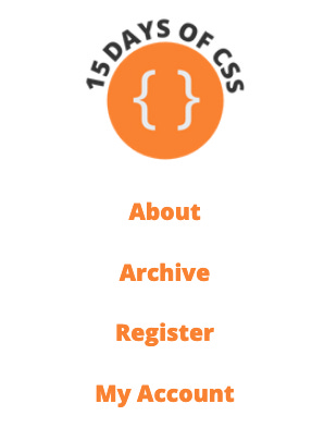
Our mobile display should ultimately be hidden behind a 🍔 hamburger button, but we'll save that for another day.
Step 1: Get the usual styles in place
By now, you should be pretty familiar with all of this code:
html {
  box-sizing: border-box;
}
*,
*::before,
*::after {
  box-sizing: inherit;
}
body {
  font-family: "Open Sans", sans-serif;
  font-size: 1.2rem;
}
ul {
  list-style-type: none;
  margin: 0;
  padding: 0;
}
a {
  color: #fa8231;
  text-decoration: none;
  display: block;
}
a:hover {
  color: #3867d6;
}
Step 2: Add mobile-specific styles
To the ul style add the following:
ul {
  display: flex;
  flex-flow: column wrap;
  gap: 1.5rem;
  align-items: center;
}
This tells our list to display with Flexbox in a column. We don't need justify-content as this would align our items VERTICALLY (the main axis) in a column context, and they're already fine the way they are. However, we do need align-items, which will center the links on the page HORIZONTALLY (cross axis) in a column context. (Yes, that is a bit confusing and easy to forget. It's not just you.)
That's pretty much it for our mobile menu. Again, we'll add a hamburger menu... tomorrow!
Step 3: Add the media query and style for tablet

The correct breakpoint for your media query happens wherever you think it needs to happen to look good. There aren't any best practices or set of standard breakpoints in a world of a million devices with unique screen sizes, unfortunately.
First, let's make our column into a row:
@media (min-width: 550px) {
  ul {
    flex-flow: row wrap;
    justify-content: center;
  }
}
With flex-flow, we override the settings that came before. In the case of justify-content, it's an additional style for the ul.
These two styles place the logo and all nav items on the same line. To get the logo to occupy its own line, I need to set its flex-basis property to 100%, such that the remaining navigation items will wrap to the next line. Finally, I'll center the logo inside of its box. These styles are inside of the above media query.
li:first-child {
  flex-basis: 100%;
}
li:first-child a {
  text-align: center;
}
Step 4: Add the media query and styles for desktop

The final change is to move the logo back to the same row as the navigation, then push it to the left side of the page.
@media (min-width: 850px) {
  li:first-child {
    flex-basis: auto;
    margin-right: auto;
  }
}
🖥 Today’s CodePen examples
View these navbars as mobile first or desktop first in today's example CodePens.
👩🏽💻 Challenge: Martial arts and navbars
👩🏽💻 Responsive web design means learning to make your code and designs adaptable - As Bruce Lee once said, "Be water, my friend." Be water with today’s CodePen challenge!
📚 More information and examples
📽 LinkedIn Learning: HTML and CSS Creating Navigation Bars (subscription required)
📽 Flexbox and Grid version 2 at Frontend Masters (subscription required)
https://codepen.io/maeyler/pen/QWgYqdX
Very nice exercise