#15DaysOfCSS Day 13: CSS-Only Hamburgers 🍔
Hiding navbars behind hamburger icons
🎉📚Get the #15DaysOfCSS e-book📚🎉
These #15DaysOfCSS posts will be compiled into an e-book — pre-order now!
Email is great, and blogs are awesome, but it can be challenging to use them as a reference in the future. We'll be assembling this month's work into an e-book.
Today is the day we bring it all together! On Day 11, we learned about accessible icons. On Day 12, we learned about changing layouts with media queries. Today, we'll learn about the hamburger button. To create this, we'll need a hamburger icon and a bit of skill in moving our mobile menu.
We'll continue with our example from Day 12, adding elements and CSS to make our hamburger menu.
Step 1: Install hamburger and close icons
Follow along with today's CodePen example
We'll use Font Awesome again for our icons, but as stated on Day 11, you may absolutely use individual SVGs or another icon font set for this work. (It may even be preferred!)
Install Font Awesome in the CodePen, and look up the code for the hamburger and close icons on Font Awesome's website. We'll need two snips of HTML to add the hamburger and close icons:
<!-- hamburger icon -->
<a class="hamburger" href="#navbar" aria-label="Open main menu">
  <span class="sr-only">Open main menu</span>
  <span class="fas fa-bars" aria-hidden="true"></span>
</a>

<!-- close icon -->
<a class="close" href="#" aria-label="Close main menu">
  <span class="sr-only">Close main menu</span>
  <span class="fas fa-times" aria-hidden="true"></span>
</a>
The code should be mostly familiar to you, except for two additions. First, in each <a> element, we've added an aria-label to state what happens when these icons are clicked. We've also placed the screen reader text before the icon. (These two <span> elements may go in any order.)
Second, notice that we have a hypertext reference for the href attribute for the hamburger icon, but not the close icon. #navbar will reference an ID that we'll need to place in our HTML to make the navbar appear. For the close icon, any href will do, as this will simply make our navigation disappear when clicked.
Where should we place this HTML?
Think about what needs to appear or disappear on the page at different moments in time.
When the hamburger button is clicked, it makes the full navbar appear. If we place the hamburger button inside of <nav>, then the button will not be visible because the navbar is hidden by default. Likewise, the close button should not be visible unless the navbar is also visible.
Therefore, our revised HTML may look something like this (abbreviated for space - see the example for the full HTML):
<header>
  <a class="hamburger" href="#navbar" aria-label="Open main menu">
     <span class="sr-only">Open main menu</span>
     <span class="fas fa-bars" aria-hidden="true"></span>
  </a>
  <nav id="navbar">
    <ul>
      <li><!-- all nav items here, one at a time -->
    </ul>
    <a class="close" href="#" aria-label="Close main menu">
      <span class="sr-only">Close main menu</span>
      <span class="fas fa-times" aria-hidden="true"></span>
    </a>
  </nav>
</header>
We introduced <header> to associate the hamburger button with the navbar. It's semantic and makes sense here. The close button is placed after the unordered list, but inside the <nav> element. It will show when our navbar is visible and the CSS permits it to display. Finally, we've added an ID of navbar to the <nav> element. That means when the hamburger button is clicked, the navbar is triggered. It doesn't do anything just yet, but it will!
We'll also add a little CSS to style the buttons:
.hamburger, .close {
  font-size: 2rem;
  color: #fa8231;
  padding: 1rem;
}
Step 2: Make the menu appear and disappear
Follow along with today's CodePen example
The goal is to click the hamburger button and that makes the menu appear. Click the close button, and the menu disappears. One way to make this happen is to push the navbar completely off screen by default. When the hamburger button is clicked, the navbar is pulled on screen. The close bar resets the default state of the navbar off screen.
The navbar is enclosed by the <nav> element, so that's where we need to apply our styles. First, let's get the menu looking the way we want when it's on screen. The menu should cover the full window in the mobile view. To make that happen, we’ll need absolute positioning, plus a viewport-based width and height to fully cover the window.
nav {
  background-color: #fae2d2;
  position: absolute;
  z-index: 1000;
  top: 0;
  left: 0;
  width: 100vw;
  height: 100vh;
  overflow: hidden;
}
Absolute positioning pulls the element in question out of the normal flow and places it wherever you want it to be. In this case, we're setting it at the top left corner of the screen, which will place it just inside the browser window. (For a more full explanation of absolute positioning, see CSS Tricks.)
We place the navbar on top of everything with z-index, then make it occupy the full area of the screen by setting width and height to 100 viewport units. Finally, I've given it a pale orange background, just so you can see how the layout changes over time more easily.
(The width and height dimensions are up to you. In this case, using viewport units, we’ve caused the navigation to cover the entire viewport. If you want to cover part of the viewport, adjust your units accordingly.)
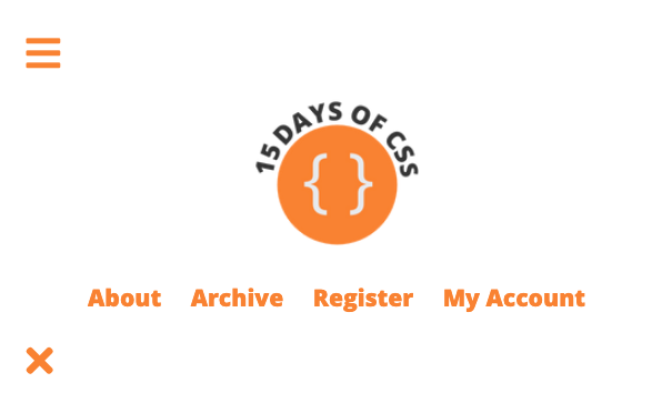
At a mobile dimension, now the screen should look like this:
Let's get the close button and navbar cleaned up. Currently they're smashed to the edges of the screen. These are siblings in the HTML, with the parent <nav>, so we may use Flexbox to align these two elements. This will bring both the navigation and the close button to the center of the screen. Adding the margin on the <ul> will push the close button back to the right edge.
nav {
  display: flex;
  justify-content: center;
}
ul {
  margin: 1rem auto 0 auto;
}
Finally, the menu looks great, but it's permanently on the screen! How can we move this lovely navbar off the screen? Using CSS transform:
nav {
  transform: translateY(-100%);
  transition: transform 0.2s ease;
}
Here we've told the menu to move up, completely off the screen. We've also stated that when there's a transition, we'll change the transform property in 0.2 seconds using the ease style of animation. We've not executed that transition yet, so currently that does nothing. Now our screen looks like this:
The final nav style looks like this:
nav {
  background-color: #fae2d2;
  position: absolute;
  z-index: 1000;
  top: 0;
  left: 0;
  width: 100vw;
  height: 100vh;
  overflow: hidden;
  display: flex;
  justify-content: center;
  transform: translateY(-100%);
  transition: transform 0.2s ease;
}
Step 3: Trigger the event to bring the menu on screen
Follow along with today's CodePen example
As you may know, CSS has no "onClick" event the way JavaScript does. The only "event" that CSS has is the hover state. Fortunately, we now have the :target pseudoclass, which helps in some ways, although it’s not a true event like hover. According to MDN:
The
:targetCSS pseudo-class represents a unique element (the target element) with anidmatching the URL's fragment.
We'll add this style to our CSS:
nav:target {
  transform: translateY(0);
}
When the hamburger button is clicked, it targets the navbar. That's when this style will override the default nav style and ask for the navbar to be pulled down from the top of the page, where it is now (at translateY(-100%)). That transition will happen over 0.2 seconds.
You should now have a working hamburger button and mobile menu!
Step 4: Cleanup!
Follow along with today's CodePen example
We added a bunch of new mobile styles, which will affect our navbar at other dimensions thanks to our min-width media queries. Time to go through our code and change the CSS in the media queries to counteract anything we've added that we don't want at larger breakpoints.
We didn't even have a nav style until adding the hamburger button functionality, so let's start by neutralizing these styles. Place this style inside of the tablet media query:
nav {
    background-color: white;
    position: static;
    width: auto;
    height: auto;
    overflow: auto;
    display: block;
    transform: translateY(0);
}
ul {
    margin: auto;
}
Change the background to white from orange. Set the position to static, which is the default setting for the position property. Set width, height, and overflow to auto, to neutralize the previous settings. Set display to block to turn off Flexbox. And finally, set the transform property back to zero. Let's also set the margin to auto for our ul element, to turn off the adjustments we made earlier. Your screen should now look like this at a tablet dimension:
As for the icons, we'll hide them away from everyone, as they're not needed at larger screen sizes:
.hamburger, .close {
    display: none;
}
All of the other styles we set for tablet and desktop dimensions should be fine as they are.
And there you have it -- a hamburger button with CSS, no JavaScript required!
🖥 Today’s CodePen examples
Follow along with today's CodePen example
👩🏽💻 Challenge: Martial arts and navbars part 2
👩🏽💻 Continue with the martial arts navbar you created in yesterday’s challenge, adding a hamburger button to it.
Make it easier: Use one of the earlier non-responsive navbars you’ve created and add a hamburger button to it instead.
📚 More information and examples
📚 CSS Tricks: Absolute, Relative, Fixed Positioning: How Do They Differ?
📽 LinkedIn Learning: HTML and CSS Creating Navigation Bars (subscription required)
📽 Flexbox and Grid version 2 at Frontend Masters (subscription required)


